By Juliana Savoia Group
We walk through a lot of homes in Coconut Grove, and color often tells us whether a room feels finished or just painted. Color psychology in home design is not simply a design trend but rather a pivotal aspect buyers psychologically respond to before they can even truly say why a room feels right or off to them. Between the tropical light here and the mix of historic, Mediterranean Revival, and modern homes across the Grove, the right palette can either work with a house or fight against it. Here is what we tell clients when they’re trying to change how a room feels, not just how it appears in photographs.
Key Takeaways
- Warm colors like red, orange, and yellow tend to raise energy, while blue, green, and purple tend to calm a room down.
- Coconut Grove's natural light and greenery change how a color reads indoors compared to a home with less light.
- Color psychology in home design works best room by room, not as one palette applied to an entire house.
- Neutral tones like white, gray, and brown carry their own psychological effect, even without a strong color statement.
Warm Colors For Rooms Built Around Energy
Red raises energy in a room and can even stir up passion, which is part of why it shows up so often in dining rooms and kitchens. Orange works in a similar way, boosting enthusiasm and making it a strong choice for a home gym or a playroom. Yellow leans toward happiness and creativity, though it can feel overwhelming if it covers every wall in a large room.
We make sure clients know these colors carry real energy, so they work best in the rooms where you want activity, not rest. A bedroom painted a bold red or bright yellow can end up working against the room's whole purpose.
We make sure clients know these colors carry real energy, so they work best in the rooms where you want activity, not rest. A bedroom painted a bold red or bright yellow can end up working against the room's whole purpose.
Why These Colors Belong In Active Spaces
- Red tends to raise energy and works well in kitchens and dining rooms, not bedrooms.
- Orange increases enthusiasm, which fits an exercise room, playroom, or creative studio.
- Yellow encourages happiness and creativity but works best as an accent rather than covering every wall.
Cool Colors For Rooms Built Around Rest
Blue is often described as the most calming color available, which makes it a common choice for bedrooms and bathrooms. Green tends to lift mood and support a sense of inner peace, and it works in almost any room except a space meant for high energy. Purple, especially in lighter shades like lavender, produces a similar calming effect without feeling as cold as some blues.
We like using this group of colors in the rooms where a home should invoke a sense of peace. Color psychology in home design often comes down to matching the color to what the room is used for.
We like using this group of colors in the rooms where a home should invoke a sense of peace. Color psychology in home design often comes down to matching the color to what the room is used for.
Why These Colors Fit Rooms Meant To Slow Down
- Blue supports relaxation and sleep, which makes it a strong fit for bedrooms and bathrooms.
- Green works in most rooms and tends to help when a space has felt flat or low energy.
- Lighter shades of purple, like lavender, bring calm without the coolness of a deep blue.
Why Neutrals Still Count As A Color Choice
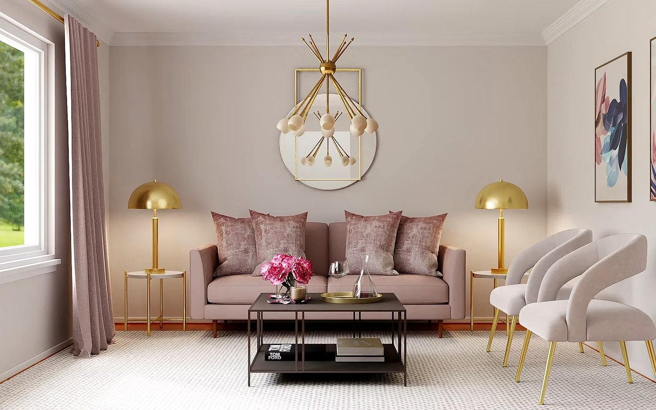
White sharpens focus and can make a smaller room feel larger, though too much of it in one space can start to feel sterile. Gray has a more neutral emotional effect on its own, but it can feel draining if it is the only color in a room. Brown carries a grounding, stable feeling, which is part of why it shows up so often in living rooms and dens.
We use these tones to balance out a bolder color somewhere else in the house, not as a replacement for having a plan at all. A neutral palette still sends a message, even if that message is quieter.
We use these tones to balance out a bolder color somewhere else in the house, not as a replacement for having a plan at all. A neutral palette still sends a message, even if that message is quieter.
Why Neutrals Need Just As Much Thought As Bold Colors
- White works well for smaller rooms but benefits from texture or accents so it does not feel sterile.
- Gray pairs well with other colors but can feel draining as the only tone in a room.
- Brown adds a grounded, stable feeling, especially in living rooms and shared spaces.
Matching Color Psychology To Coconut Grove's Architecture
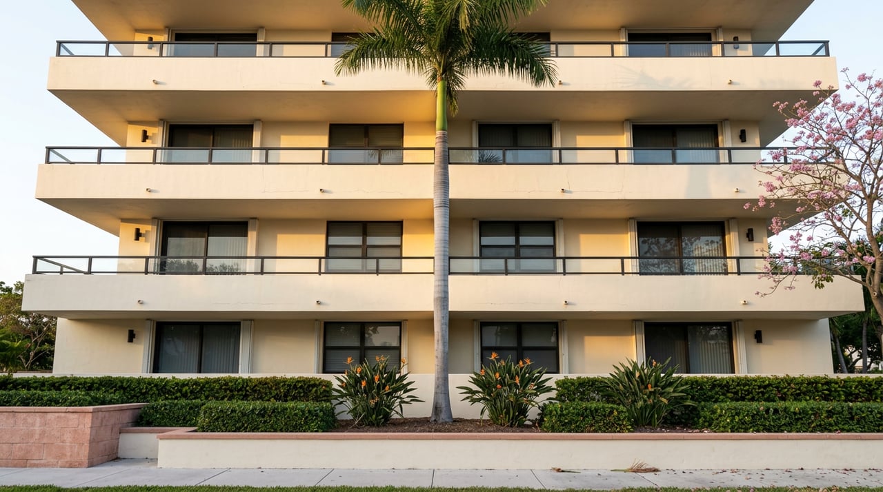
Coconut Grove's historic homes, built with Dade County pine and coral rock, tend to hold warm, earthy tones well, especially alongside wraparound porches and natural wood. Mediterranean Revival homes lean into soft stucco tones, terracotta, and warm neutrals that match their arched doorways and courtyards. Newer tropical modern homes, with floor-to-ceiling glass and open floor plans, tend to handle cooler blues and greens especially well, since so much natural light and greenery already comes through the windows.
We make sure to walk the actual light in a home before recommending a palette, since Coconut Grove's tree canopy changes how a color reads room to room. Color psychology in home design only works if it accounts for the light a house actually gets, not just the color on a paint chip.
We make sure to walk the actual light in a home before recommending a palette, since Coconut Grove's tree canopy changes how a color reads room to room. Color psychology in home design only works if it accounts for the light a house actually gets, not just the color on a paint chip.
Why Local Light And Architecture Change The Rules
- Historic homes with wraparound porches tend to suit warm, earthy tones over sharp brights.
- Mediterranean Revival homes pair naturally with terracotta and soft neutral palettes.
- Tropical modern homes with more glass and greenery outside often handle cooler tones well.
Frequently Asked Questions About Color Psychology In Home Design
What color makes a room feel bigger?
White and other light neutrals are among the top choices for making a room feel bigger, mainly because they reflect more light. Pairing a light wall color with natural light, like the kind common in Coconut Grove's open floor plans, tends to amplify that effect.
What is the best color for a bedroom?
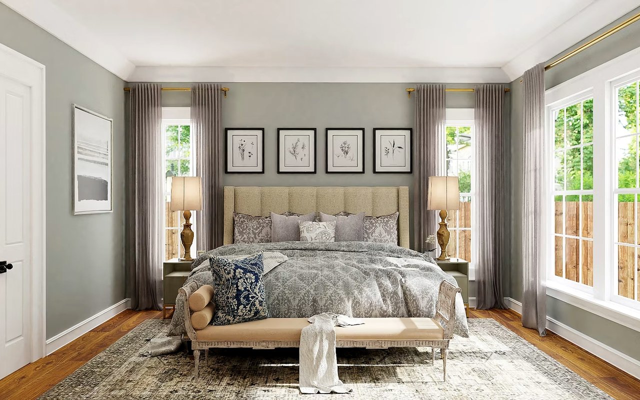
Blue is generally considered the most calming option for a bedroom, since it supports relaxation and sleep. Lighter shades of green or purple can work as well if blue does not fit the rest of the home's palette.
Should every room in a house use the same color palette?
Not necessarily. Color psychology in home design tends to work best when the palette shifts slightly from room to room, based on what each room is actually used for. Personal preference still plays a real role, so these effects are a starting point rather than a strict rule.
Prepare Your Coconut Grove Home With The Juliana Savoia Group
The Juliana Savoia Group tours homes across Coconut Grove regularly, and color is one of the first things we notice about whether a house is ready to show well or not. We pay attention to how a home's architecture, whether historic, Mediterranean Revival, or tropical modern, works with the colors already on the walls. That perspective helps us guide sellers toward small changes that make a real difference before a home goes on the market.
If you are getting a Coconut Grove home ready to sell or just want it to feel more like yours, we are happy to walk through it with you. Reach out to us to learn more about how we help sellers prepare their homes before listing.
If you are getting a Coconut Grove home ready to sell or just want it to feel more like yours, we are happy to walk through it with you. Reach out to us to learn more about how we help sellers prepare their homes before listing.